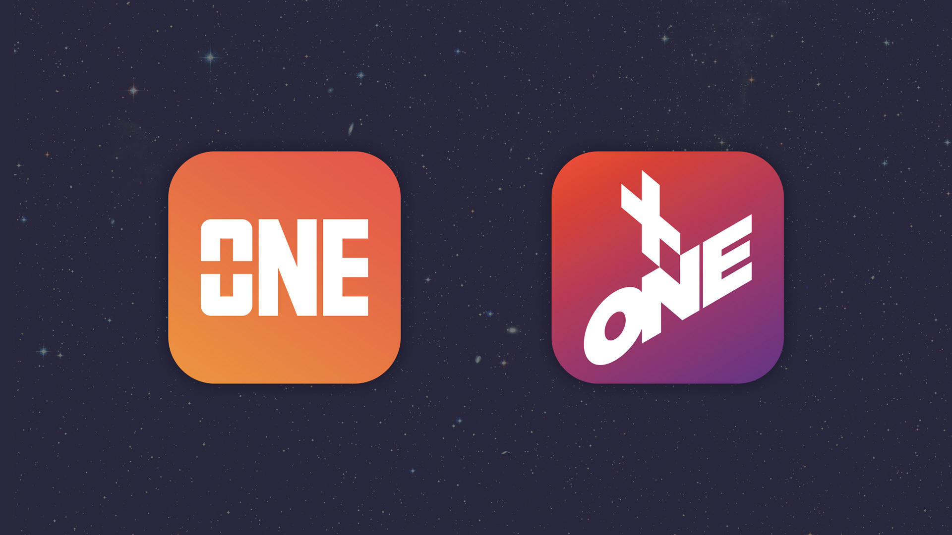
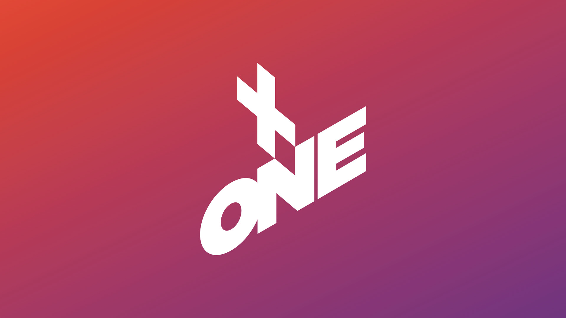
Plus One, an app that reduces the organization of an event to a couple of taps, needed a logo that would mainly serve as the app icon. Two options were developed and proposed, and both of them are centered around negative space design. In the first one, the plus symbol is carved inside the counter of the "O". In the second more elaborate option, the intersection of the plus symbol and the "one", aligned on a pseudo-isometric grid, creates the abstract symbol of a compass. The client eventually went with the simpler option and picked the first design.